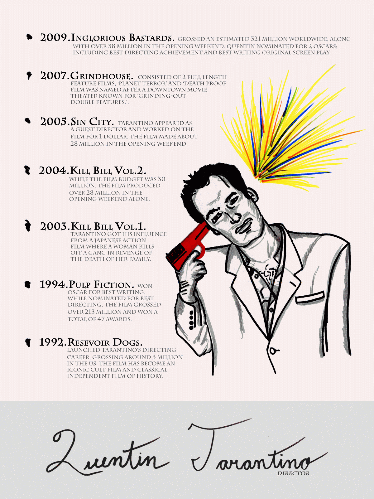
For my history poster project I decided to commemorate an individual that has influenced me. For this, I chose Quentin Tarantino (mainly focusing on his directing). Knowing that I was going to do the poster on him, it was easy to choose my style of design to commemorate him best. I chose to do the poster on modernism. I chose this particular style of design because I felt it was the best way to teach the audience about Quentin Tarantino. I projected the style of modernism in the poster project in many ways including; the use of color, simplicity, and typography. For my use of color, I wanted to display an ironic balance between beauty and emotionless. I made most of the poster in gray scale while the gun and the explosion were in bright colors. I did this because I wanted to show that although Tarantino shows a dark, dismal side, he has a creative mind and shows it well in his works. I also portrayed this sense of balance with the typography. I used 2 different types of font. For the majority of the text I used a structured, straight-edged font while I used a hand-written cursive text for his name.
My project conforms to the rule of thirds in many ways. Everything on the poster puts emphasis on the lines of the rule of thirds. I also used a strong sense of alignment. I aligned the paragraphs of the text with the title of the particular films. I also aligned all of the text to conform to the shape of the illustrated Quentin Tarantino. I also used the other principles that we learned in the first project in my history poster project. I used the concept of emphasis with the use of color in the illustration. I also put emphasis on the titles of the films by using bold, larger font. I applied the use of balance with the sense of negative space. I did not fill in all the gaps, instead I used negative space to bring a sense of simplicity to the project. Contrast can be seen in the project by the use of gray scale and opacity in the text and the background of the name. I used flow in the conformity of the text to the Quentin Tarantino illustration. I used repetition in the use of consistency among the different films in the way that they were bulleted.

Tuesday, December 20, 2011
Monday, December 19, 2011
Thursday, December 8, 2011


Tuesday, December 6, 2011
History Poster
Who? Quentin Tarantino; Director, producer, actor. Poster will be focusing on his directive work.
What? Major films that he has done. (6-8 films)
When? From early 1990s to present.
How? Adobe Photoshop CS5
Style? Bauhaus/Modernism
What? Major films that he has done. (6-8 films)
When? From early 1990s to present.
How? Adobe Photoshop CS5
Style? Bauhaus/Modernism
Thursday, December 1, 2011


Tuesday, November 29, 2011
History Poster Art Styles

Art Nouveau
- decorative
- soft colors
- curves
- layers
- sense of depth

Bauhaus
- bold colors
- strong lines
- simplicity

Art Deco
- shapes (curves, triangles)
- angles
- bold, vivid color

Russian Constructivism
- bold color (yellow, red, black)
- sharp angles
- alignment

Postmodernism
- edgy
- variety of colors
- layers
- typography

Modernism
- simplicity
- bright colors
- definitive shapes
- layering objects

Swiss Design School
- typography
- structured shapes
- few bold colors
Tuesday, November 22, 2011
My favorite stamps

This stamp represents the design style of Bauhaus, which
originated in the 1920s. The stamp represents this
particular style of design in its use of simplicity and color.
The stamp is very simple and unique. Bauhaus uses
different angles to project their single subjects on and
that is what they did with this chair.

This stamp represents the design style of
post-modernism. It represents this particular
its creative use of animation and color. The
stamp shows use of only a few colors and
the face has been altered to give it an
animated look.

This stamp represents the design style of Art Deco. Art Deco
1920s and is known for its use of color, layers, and solidarity.
As you can see in this stamp, Art Deco uses many bright
colors, circular shapes, and layers to give it that signature
feel.
Thursday, November 17, 2011

Thursday, November 10, 2011


Tuesday, October 18, 2011

Tuesday, October 4, 2011
Project 1 Essay
For this project we were instructed to use 6 given words (emphasis, contrast, balance, alignment, flow, and repetition) and to implement them together in a way that aesthetically defines the actual word in one whole piece. This project proved to be challenging for the many elements that needed to be applied. The piece needed to follow precise guidelines to project an idea. Some of the major guidelines included; using the 'Rule of Thirds', creating a defined hierarchy, and showing creativity when applying each word. To achieve the goals for this project, I used the 'Rule of Thirds' to organize the words in a way that implemented the overall purpose.
First, I wanted to make the word 'Emphasis' the main point of the project. So, I put the word in very bold and large font. I placed the word in the upper right hand corner aligned with the lines of the 'Rule of Thirds'. Next, I worked on the second most important word 'Balance'. For the word balance I made the size of the letters increase throughout the word. This implemented the definition of the word in the word itself. I placed the word in the bottom right corner to move the viewers eye across the project. I then worked on the word 'Contrast'. With this word I projected the definition by playing with the gray scale and font size throughout the word. I placed the word on the left side of the project to move the viewers eye to the third main point. After the first three main points (emphasis, balance, contrast) were done and accomplished with the 'Rule of Thirds' and the hierarchy, I worked on the rest of the words to fill in the empty space while creating negative space at the same time. With alignment I made the word very straight and stern looking, aligning the word with the line of the 'Rule of Thirds'. I also aligned the N with the O in contrast in a way that it gave the project a sense of depth. Next, I worked on the word 'flow'. I did flow in a way to portray the idea of flowing. To accomplish this I repeated the word many times and put it along a flowing path. I put the path in a space to take up just enough empty space to conserve the amount of negative space in the piece. Lastly, I worked on the word 'repetition'. With this word I simply repeated the word repetition many times in paragraph form. I put it on an angle, in small font on the right side of the project. I then changed the gray scale to give the impression that it is being overlapped by the word balance.
Overall, I have accomplished the goals of the project through the 'Rule of Thirds', the hierarchy of the words, the variance of gray scale, and the importance of negative space.
Monday, October 3, 2011


Thursday, September 29, 2011
EDIT: Posts of sketches
My sketches that I scanned ended up cropping out a small portion of the sketches. I will be posted photos of the sketches soon, instead of using the scanner.


Thursday, September 22, 2011

Subscribe to:
Posts (Atom)